Controversial Rebrands: Navigating the Fine Line Between Modernization and Heritage
In late 2024, Jaguar unveiled a new logo as part of a broader rebranding initiative aimed at modernizing its image. The updated design replaced the iconic leaping jaguar emblem with a minimalist wordmark and abstract geometric shapes. This change was intended to refresh the brand’s identity and appeal to a younger, more design-conscious demographic.
However, the rebrand sparked immediate backlash. Loyal customers and automotive enthusiasts criticized the move, viewing it as an unnecessary departure from Jaguar’s rich heritage and distinctive identity. On the other hand, some viewed it as a bold move by Jaguar to stand out in a fiercely competitive automotive market increasingly disrupted by electric vehicles. The controversy quickly became a topic of discussion on social media and in the automotive press, with many calling for a return to the classic logo.
Other Notable Rebranding Controversies
Jaguar’s experience is not unique. Several other brands have faced significant backlash over rebranding efforts:
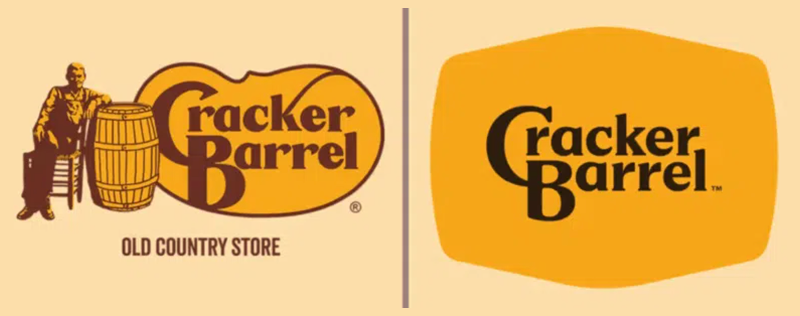
- Cracker Barrel (2025): The restaurant and gift shop chain unveiled a new, modern logo, removing its iconic “Uncle Herschel,” which sparked strong backlash from loyal customers and public figures, including President Donald Trump, and led to a sharp drop in its stock price. In response, Cracker Barrel reinstated the original logo, resulting in a partial recovery of its stock value.
- Korean Air (2025): South Korea’s biggest airline introduced its first major rebrand in over 40 years, unveiling a minimalist logo and a new aircraft livery intended to modernize the brand while nodding to Korean heritage. While the redesign aligns with global design trends and coincides with the airline’s acquisition of Asiana Airlines, it has faced criticism for removing iconic elements, resembling other carriers, and potentially diluting its cultural identity.
- Gap (2010): The clothing retailer introduced a new logo intended to modernize its image. The minimalist design was met with widespread criticism for being generic and uninspired. Within a week, Gap reverted to its original logo.
- Tropicana (2009): The juice brand redesigned its packaging, replacing the iconic orange with a straw image. Consumers found the new design unrecognizable, leading to a 20% drop in sales. Tropicana quickly returned to its previous packaging.
The Trend Toward Flat Design in Branding
A common thread in many recent rebrands is the shift toward “flat design”, a minimalist approach that emphasizes simplicity and two-dimensional elements. This trend is driven by several factors:
- Digital Adaptability: Flat designs are more versatile across various digital platforms, ensuring consistency in branding from websites to mobile apps.
- Modern Aesthetic: Minimalist designs are perceived as contemporary and can help brands appear more current and relevant.
- Improved Legibility: Simplified designs can enhance readability and recognition, especially on smaller screens.
However, this trend is not without criticism. Flat design can sometimes lead to a loss of brand personality and make user interfaces less intuitive. Research has shown that while younger users may navigate flat designs more quickly, they can also find them less user-friendly.
Balancing Modernization with Brand Heritage
The controversies surrounding rebranding efforts like those of Jaguar, Cracker Barrel, Gap, and Tropicana highlight the delicate balance brands must strike between modernization and preserving their heritage. While updating a brand’s image can attract new customers and keep the brand relevant, it’s crucial to consider the existing customer base and the emotional connections they have with the brand’s identity.
Successful rebrands often involve gradual changes that respect the brand’s history while introducing modern elements. For instance, Dunkin’ Donuts’ transition to “Dunkin'” maintained its recognizable color scheme and font, allowing for a smoother acceptance by consumers.
In conclusion, while rebranding can be a powerful tool for revitalizing a brand, it requires careful planning and consideration of both new and loyal customers. Striking the right balance between innovation and tradition is key to a successful rebrand that resonates with a broad audience.